

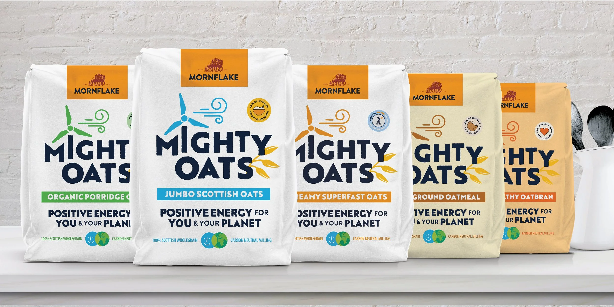
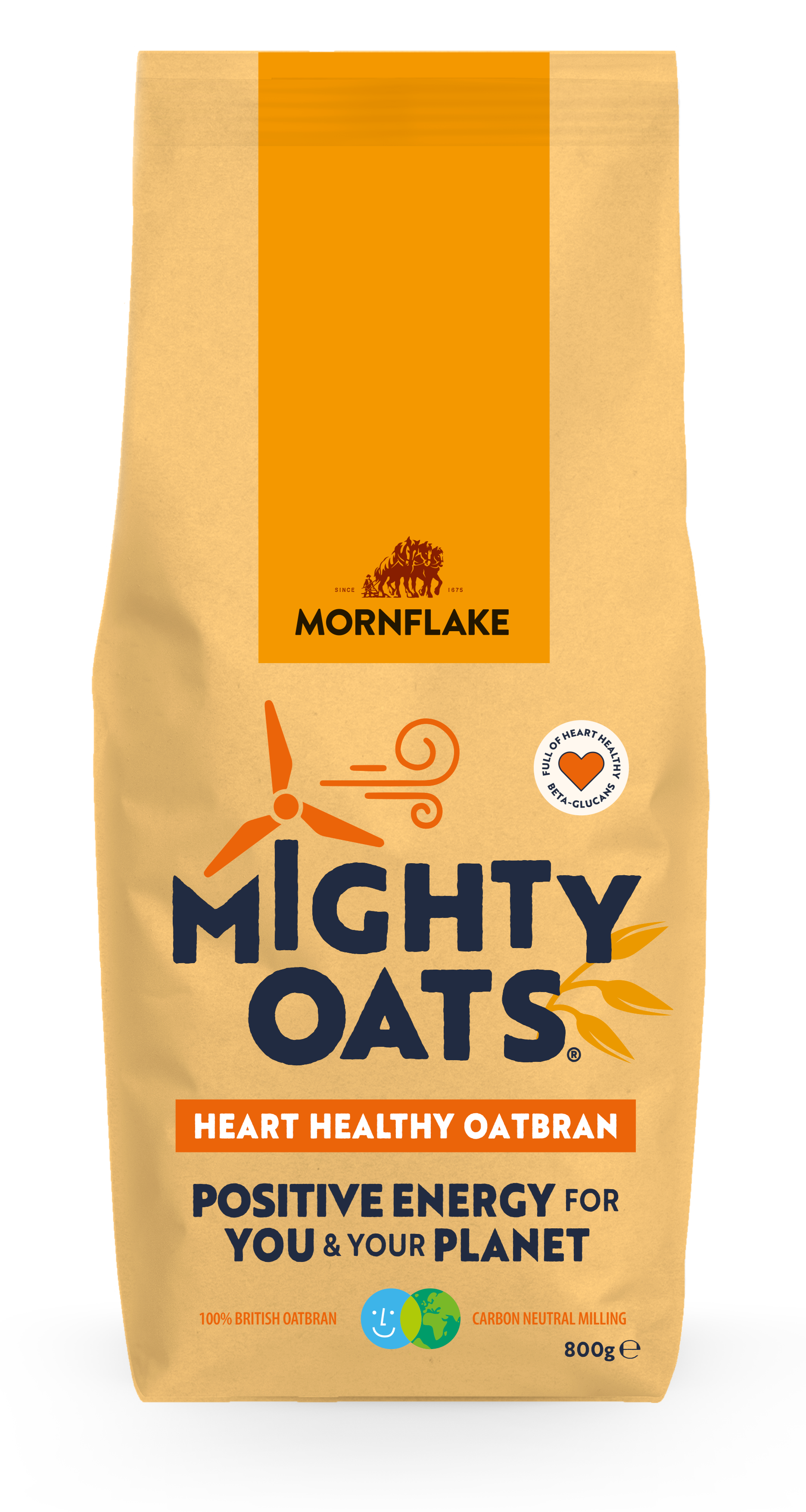
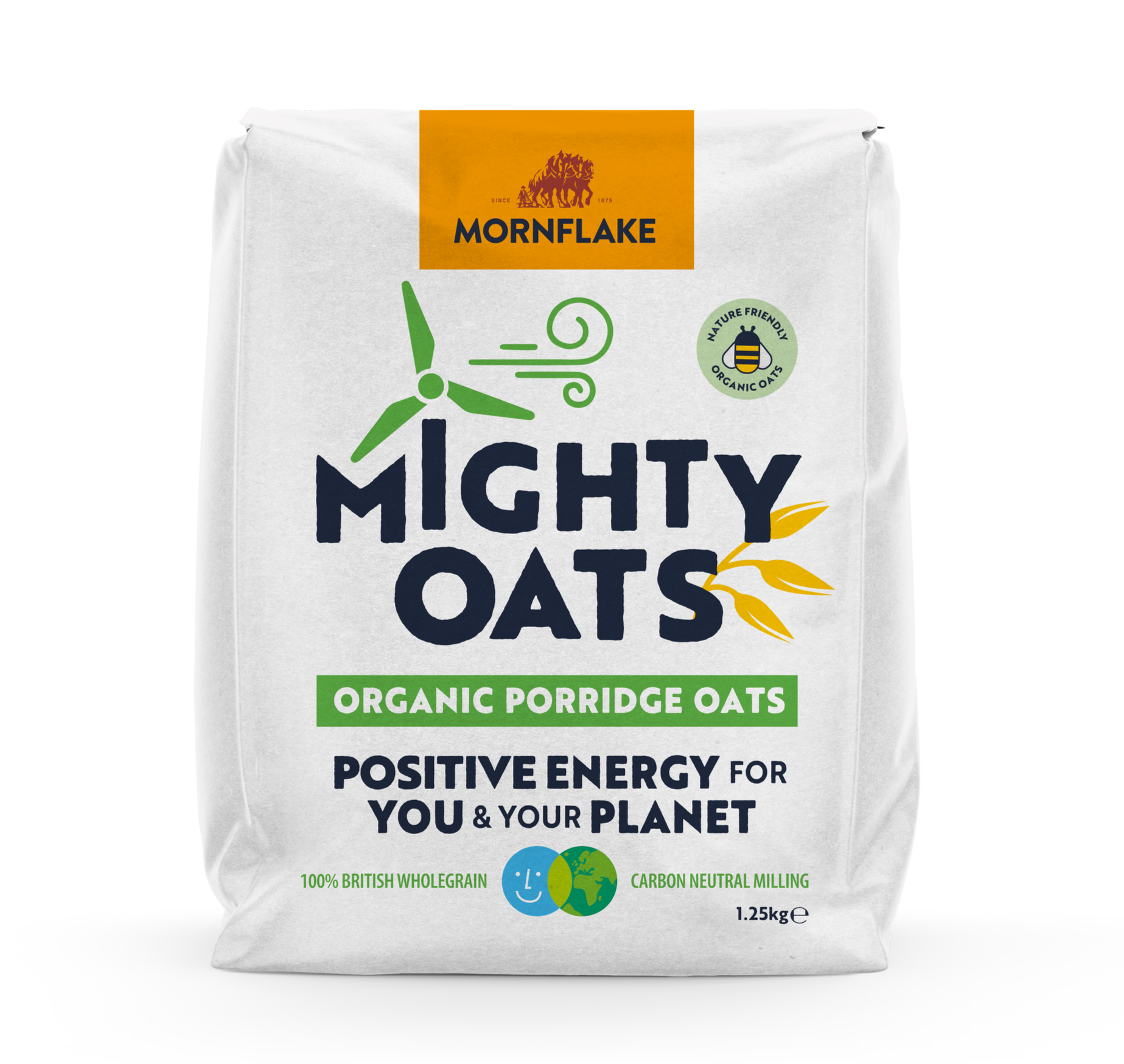
Mighty Oats
Breakfast with two powers.
ROLE: CONSUMER RESEARCH, BRAND STRATEGY, PACKAGING DIRECTION
Freelance project for Family & Friends Creative
Filed under:
Food & beverage, retail, porridge & oats, heritage, rebrand, sustainable
THE ASK
Morning Foods, millers since 1675 and makers of Mornflake, wanted to speak to a new age.
The brief was to show their genuine commitment to sustainability without falling into hollow eco-talk.
The challenge was clear: speak only of the planet and you lose people. Speak only of health and you lose relevance.
THE TURN
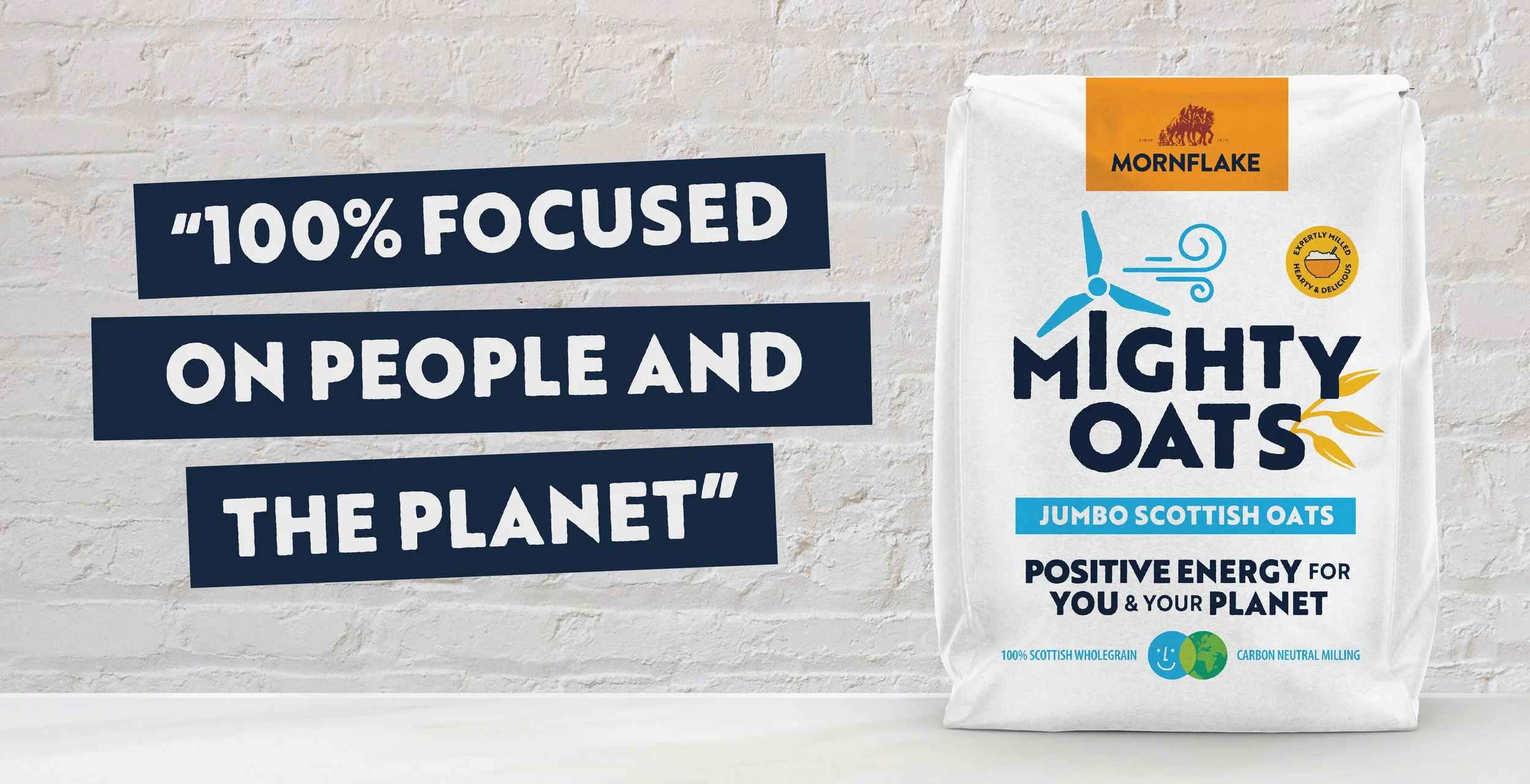
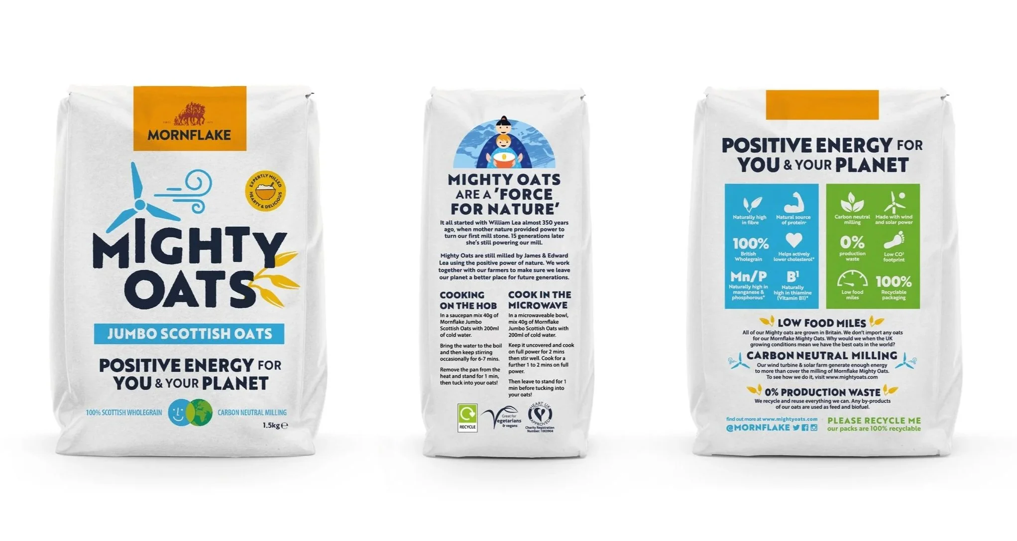
Mighty Oats was lifted from a sign-off to a brand in its own right.
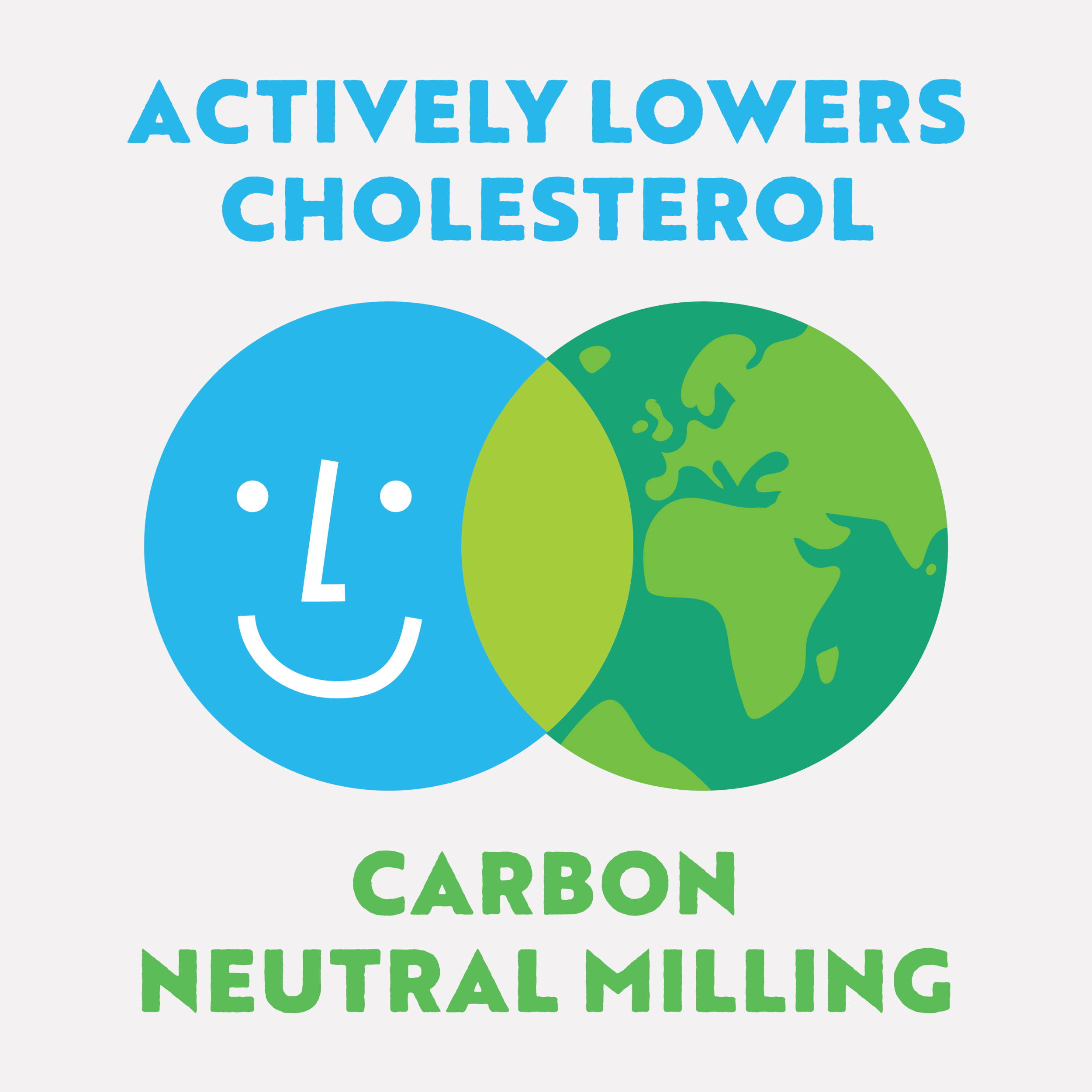
Its heart was simple: for you and your planet. Strategy and packaging direction carried that duality, health and sustainability, personal and planetary, woven together instead of kept apart.
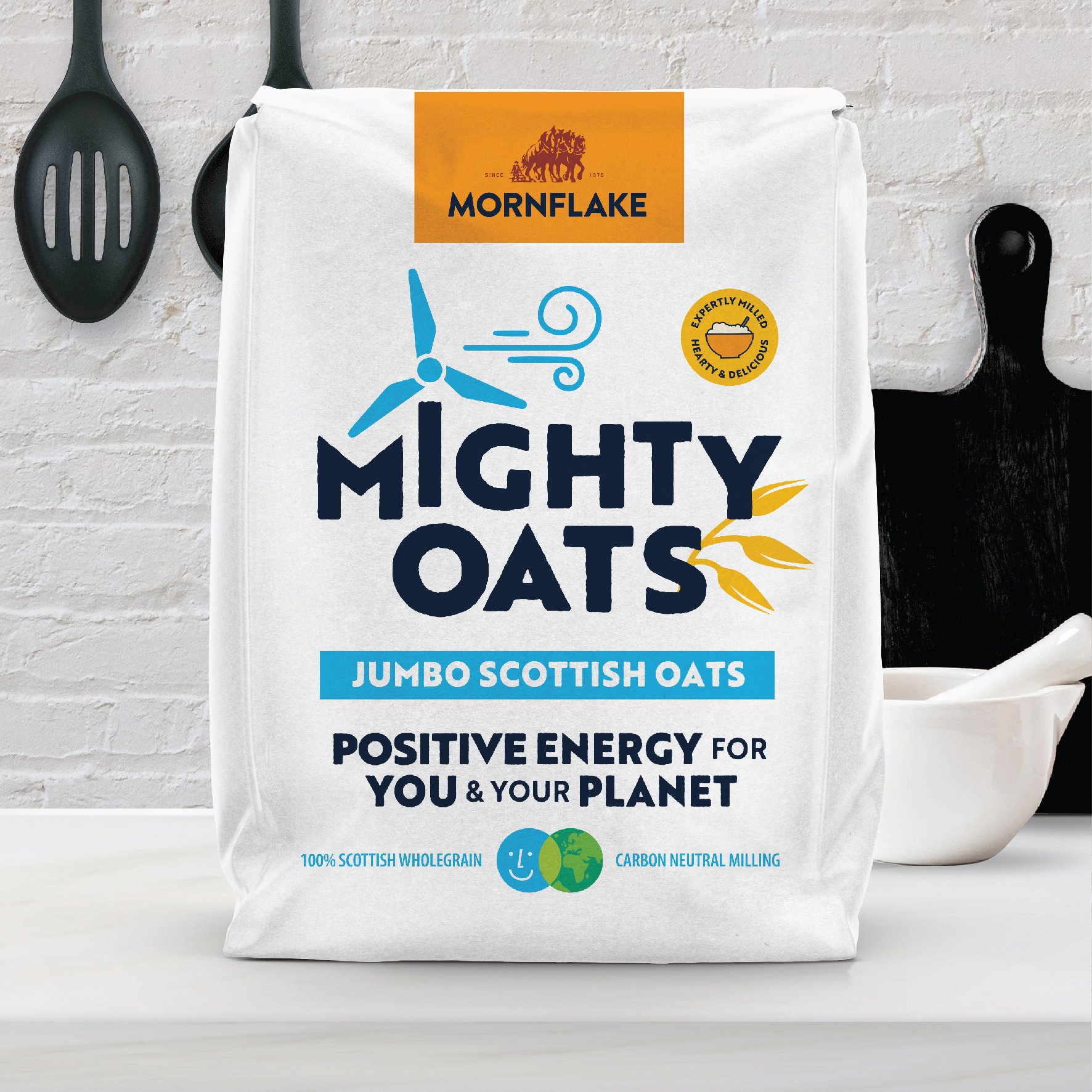
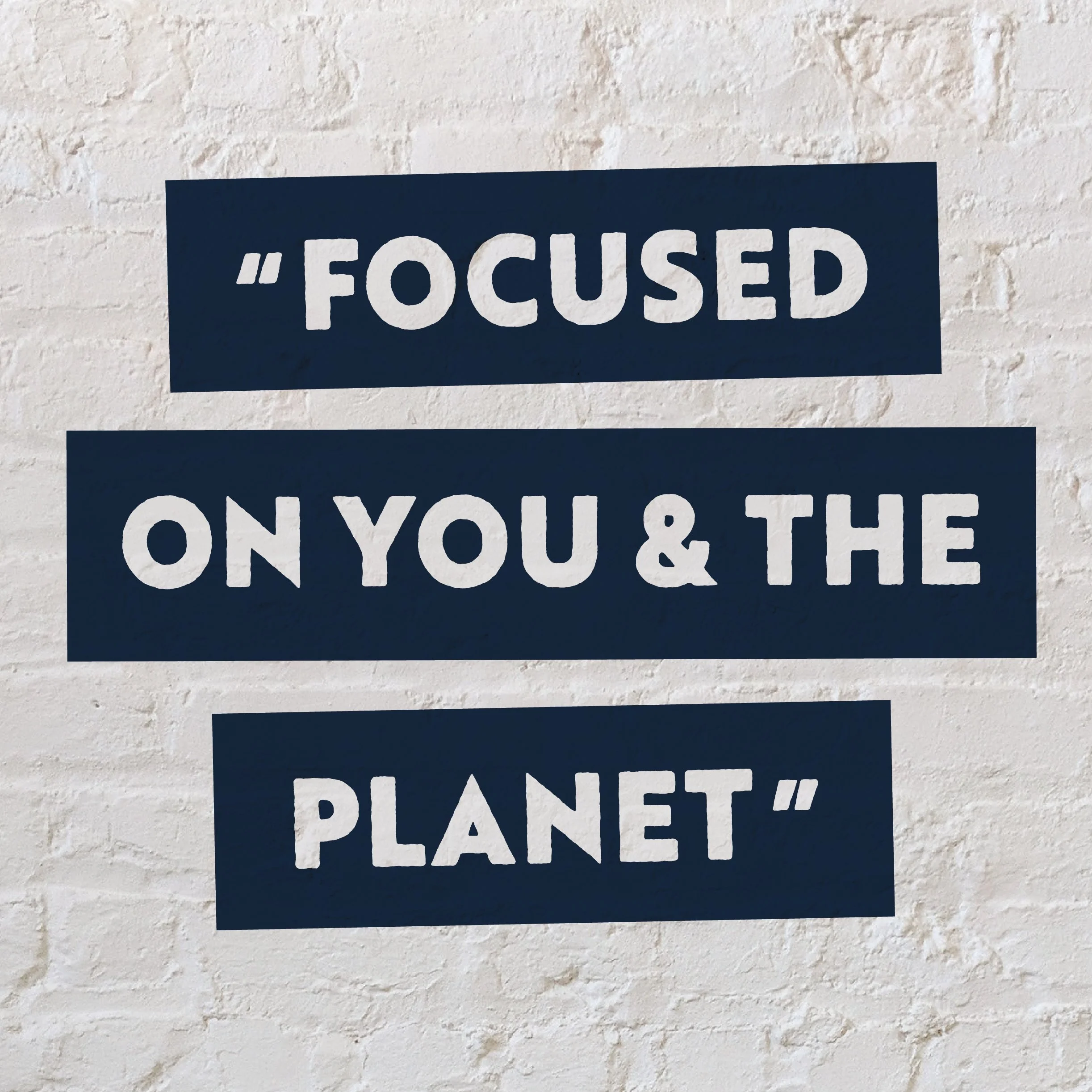
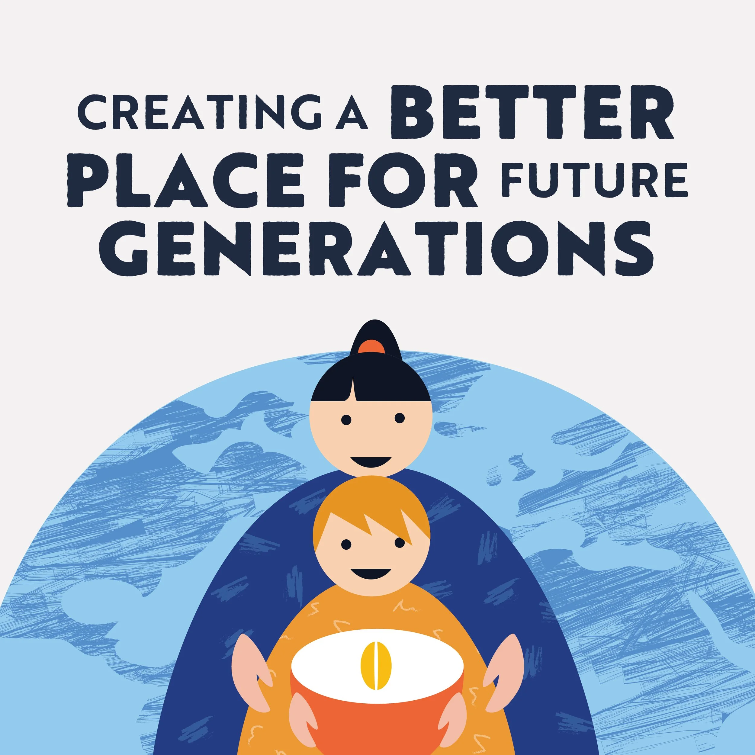
Mighty Oats made eating well feel like an act of care for yourself and the world in the same spoonful.
Images: publicly released brand assets.